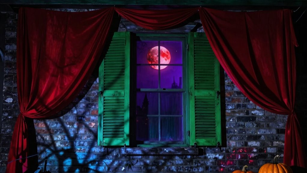
Colors in spooky design do much more than just orange and black. They influence your emotions, subconscious reactions, and cultural perceptions, heightening tension, fear, or eerie atmospheres. Deep reds can evoke danger, muted greens suggest decay, while ghostly blues create a supernatural chill. By choosing colors thoughtfully, you can amplify suspense and craft immersive experiences. If you want to unleash the full potential of spooky color schemes, there’s more to discover beyond the basics.
Key Takeaways
- Colors evoke subconscious emotional responses, enhancing suspense and fear beyond traditional orange and black themes.
- Strategic color choices can suggest decay, supernatural elements, or danger, enriching the spooky atmosphere.
- Different cultures associate colors with specific meanings, influencing audience perception and resonance.
- Using a variety of colors like ghostly blue or mottled gray deepens the mood and adds complexity to spooky designs.
- Thoughtful color application guides viewer interpretation and amplifies the immersive, eerie experience.

Have you ever wondered how certain colors evoke a spooky atmosphere in design? It’s not just about the classic orange and black; colors play a vital role in shaping the mood and emotional response of your audience. When you choose colors thoughtfully, you tap into their psychological impact and cultural associations, amplifying the eerie or unsettling vibe you want to create. For example, deep reds can evoke feelings of danger or blood, triggering instinctive reactions that heighten tension. Meanwhile, muted greens or sickly yellows can suggest decay, sickness, or something unnatural, heightening the sense of unease. These subtle cues influence how viewers interpret the scene without them even realizing it, making your design more immersive and effective. Recognizing the psychological impact of colors allows you to craft a more compelling spooky atmosphere. For instance, darker shades tend to evoke mystery, fear, and the unknown, while lighter or more vibrant hues might lessen the fear factor or add an element of playful eeriness. You might use a washed-out, ghostly blue to evoke coldness or supernatural chill, or a mottled gray to suggest fog, shadows, or mystery lurking just beyond sight. The key is knowing that colors aren’t just decorative—they’re emotional triggers. When you strategically apply these shades, you guide your audience’s subconscious reactions, heightening feelings of suspense or dread that are central to spooky design.
Cultural associations also deeply influence how colors are perceived in a spooky context. For example, in Western cultures, black is often linked to death, mourning, and the supernatural, making it a natural choice for haunted house themes. Red might symbolize blood or danger, while white can imply ghosts or spirits. But these associations aren’t universal. In some Eastern cultures, white might be associated with mourning, and red symbolizes good fortune or celebration. Recognizing these cultural nuances ensures your design resonates appropriately with your target audience. It can also help you avoid unintended connotations that could undermine the spooky effect or alienate viewers.

Halloween String Lights, 4.9Ft 10 LED Fall Fairy Lights Skull String Lights Halloween Decor Autumn Light Battery Optional 2 Flashing Modes Cute Lights 2026 Indoor Outdoor Decor for Home Yard Patio
🎃【Perfect 4.9FT Halloween String Lights】 Elevate your spooky ambiance with our classic Halloween string lights! This 4.9-foot strand…
As an affiliate, we earn on qualifying purchases.
As an affiliate, we earn on qualifying purchases.
Frequently Asked Questions
How Do Cultural Differences Influence Spooky Color Choices?
Cultural differences heavily influence spooky color choices, as you should consider regional palettes and cultural symbolism. In some cultures, red symbolizes luck or danger, making it effective for spooky themes, while in others, white can represent ghostly spirits. You adapt your palette to reflect local beliefs and traditions, ensuring your spooky design resonates authentically with your audience. Recognizing these cultural nuances helps you create more impactful and sensitive spooky visuals.
Can Color Psychology Enhance Spooky Atmosphere Effectively?
Sure, color psychology can totally boost your spooky vibe—if you want your audience to feel goosebumps and maybe a tiny bit of dread. By choosing colors with the right psychological impact, you trigger emotional responses that elevate your design from merely creepy to downright haunting. It’s like giving your spooky scene a secret weapon—because nothing screams “terror” quite like the perfect shade that whispers horror into every viewer’s subconscious.
Are There Seasonal Variations in Spooky Color Preferences?
Yes, seasonal palette shifts influence spooky color preferences. You’ll notice that during Halloween, holiday-specific hues like deep reds, eerie greens, and ghostly purples become popular, shifting away from typical orange and black. These variations help create a more immersive, timely atmosphere. By adapting your color choices to seasonal palettes, you enhance the spooky vibe and connect more deeply with the audience’s seasonal expectations.
How Do Lighting and Shadows Interact With Spooky Colors?
Lighting contrast and shadow depth play vital roles in how spooky colors appear. When you use sharp lighting contrast, it makes colors pop and creates eerie highlights, heightening suspense. Deeper shadows add mystery, making spooky colors like dark reds or purples more intense and unsettling. By carefully balancing lighting and shadows, you can amplify the haunting atmosphere, ensuring your spooky design feels more immersive and chilling.
What Are Unexpected Color Combinations That Heighten Fear?
You might think traditional spooky colors are enough, but unexpected combinations like deep purple with sickly green or icy blue with blood-red can heighten fear. These contrast sharply and play with color symbolism, triggering primal reactions. Don’t dismiss bold contrasts—they create unsettling tension that intensifies the spooky vibe. Using surprising pairings challenges expectations and taps into subconscious fears, making your design more haunting and memorable.

BlissfulTie Halloween 12 Foot Skeleton Light Kit – RGB Color Changing Giant Skeleton Lights with Timer & Waterproof, 12 ft Skeleton Accessories for Outdoor Halloween Decorations(Not Include Skeleton)
[Spooky Glow with RGB Colors] – Transform your 12 ft skeleton into the highlight of Halloween night! With…
As an affiliate, we earn on qualifying purchases.
As an affiliate, we earn on qualifying purchases.
Conclusion
So, next time you’re creating spooky designs, remember that colors aren’t just about tradition—they’re about instinct. That perfect shade of deep purple or eerie green might just be the coincidence that makes your audience feel the chill. When you pay attention to these subtle color choices, you tap into emotions you didn’t even realize you could evoke. After all, in spooky design, it’s no accident that colors hold the power to thrill and terrify.
Float Too Neon Sign Horror Movie LED Light, Gothic Wall Decor for Game Room, Man Cave, Home Theater, Haunted House, Escape Room, Party or Club, Gift for Horror Fans, 15"x9.4"
【Cinematic Quote Atmosphere】Float Too neon sign delivers an eerie glow and moody ambient lighting, creating suspense decor and…
As an affiliate, we earn on qualifying purchases.
As an affiliate, we earn on qualifying purchases.
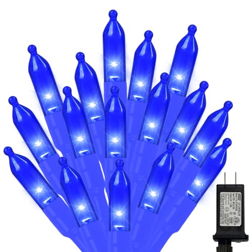
LAMPHOME 32.5FT 100LED Blue Christmas String Lights, 16 Modes Waterproof Fairy Lights Plug in, Twinkle String Lights Indoor Outdoor for Bedroom Wall Halloween Tree Party Home Decoration
Blue Christmas String Lights: Premium Bright Blue LED Lights, Upgraded 32.5FT 100LED Blue String Lights with clear wire…
As an affiliate, we earn on qualifying purchases.
As an affiliate, we earn on qualifying purchases.
