TL;DR

Get decor and gifts delivered free with Prime
- Fast, free delivery on millions of items
- Prime Video, Amazon Music and more included
- Member-only deals all year
Livingetc’s Style Pulse report for spring/summer 2027 identifies “discomfort,” or deliberate friction, as an emerging interior design direction. Designers describe unexpected colors, sharp forms and furniture that resists easy use as ways to create tension and individuality, though the report presents a trend forecast, not measured evidence of widespread adoption.
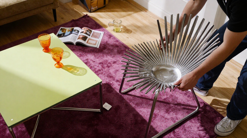
Livingetc’s spring/summer 2027 Style Pulse report identifies “discomfort” as an emerging interior design direction, pointing to acidic colors, jagged forms and furniture that challenges familiar ideas of comfort. The report frames the trend as purposeful visual or tactile friction—not a claim that homes should be unpleasant—and says designers are using contrast to make rooms feel less predictable and more personal.
The report describes a shift away from interiors associated with “quiet luxury”, which it characterizes as soft, neutral and safe. In its account, some current projects instead introduce elements that stand out or seem at odds with their surroundings. Livingetc’s writer calls that quality “discomfort,” while noting that designers may prefer the term “friction.”
Interior designer Nicholas Kaiko, founder of Kaiko Design Interiors, says a room can keep evolving through one or two elements that “don’t quite settle.” He gives examples including a particularly loud color, a surface that invites touch but feels uncertain, or a furniture piece that clashes with the rest. Kaiko cautions that the tension should be deliberate, rather than random.
Color is one route into the look. Designer Sophie Rowell, founder of Côte de Folk, describes chartreuse and deep purple in a bedroom project as an unexpected pairing that still feels calming and enveloping. She says acidic shades can add energy, but their effect depends on how they are balanced with other colors and on the room’s intended atmosphere. The report also points to a shift from rounded, flowing forms toward sharper, jagged or pointed shapes; it does not provide sales data or other measures showing how common these choices are.
How Designers Use Visual Friction
The trend matters because it challenges the idea that an interior succeeds only when every element feels harmonious, soft and broadly appealing. Deliberate contrast can make a room more expressive, give a focal point greater impact and reflect a resident’s preferences rather than a prescribed style. For readers planning a room, the report’s practical point is that a challenging color or shape does not work in isolation: its effect depends on its proportion, placement and surrounding palette.
The distinction between friction and discomfort also keeps the forecast in perspective. The designers quoted are not advocating rooms that are literally unusable or unpleasant. They describe small, considered interruptions to visual expectations, supported by calmer elements elsewhere. That leaves room for individual taste: what one person sees as energizing tension may feel distracting to another.
For the design industry, the forecast signals a possible appetite for interiors that look less universally polished. But the source is a seasonal trend report, so it establishes what Livingetc and its contributors expect to see, not proof that consumers broadly want spiked furniture, acidic paint or less comfortable chairs.
Popular right now

De'Longhi Magnifica Evo Automatic Espresso Machine with Milk Frother – Silver

Ninja Foodi 10-Quart DualZone 6-in-1 Air Fryer, Black, DZ302

iRobot Roomba Max 715 Pet Robot Vacuum with AutoEmpty Dock
As an affiliate, we earn on qualifying purchases.
From Quiet Luxury to Tension
Livingetc presents “discomfort” as a reaction to a recent preference for quiet luxury: an approach in which elegance is understated and interiors lean toward neutral, soft finishes. The report says that safe, inoffensive look has become less desirable to some designers as projects increasingly make room for moments of surprise. This is the publication’s interpretation of a change in taste, not a quantified industry-wide finding.
The report also places the trend against a run of curved furniture and softened edges. Rounded sofas and bullnose countertops have become familiar design choices, in part because soft forms are often associated with welcoming spaces. Livingetc says the new forecast includes sharper, zigzagging and spiked forms as a counterpoint. It gives examples and designer commentary, but the supplied report excerpt does not identify specific product launches, market figures or a timeline for adoption.
““What keeps a space evolving is one or two elements that don’t quite settle.””
— Nicholas Kaiko, founder of Kaiko Design Interiors
How Broad the Shift Really Is
The source is a trend forecast, not a survey of homeowners, a sales report or a study of interior projects across the market. It does not establish how many people are choosing these designs, whether interest has increased over time, or whether the trend will persist beyond SS27. The scope of the report’s research and the number of designers consulted are not stated in the supplied material.
Some details also remain open. The excerpt begins to discuss spikes and forms but cuts off before explaining the examples or designers’ views in full. It does not identify particular chairs that cannot be lounged on, nor does it show that reduced comfort is a defining feature of the forecast. The headline’s chair reference should not be read as evidence that designers are broadly rejecting usable furniture.
What the SS27 Forecast Tracks
Livingetc presents the report as its biannual Style Pulse forecast for the upcoming spring/summer 2027 season. Its next step is to publish or direct readers to the rest of that report, which is intended to cover additional predicted interior trends. The supplied material does not name a release schedule, further research milestones or specific products to watch.
Whether “discomfort” becomes a lasting consumer direction remains to be seen. More evidence would include subsequent design projects, product releases and reporting on how homeowners respond. For now, the confirmed development is that Livingetc and the designers it quotes have identified deliberate friction as a forecast for SS27, with broad adoption still unverified.
Key Questions
What does “discomfort” mean in this design forecast?
It means deliberate visual or tactile friction, such as an unexpected color pairing, a striking surface or a form that interrupts a room’s usual flow. The designers quoted describe a considered effect, not a requirement to make homes unpleasant.
Which colors does the report highlight?
The report discusses acidic shades such as chartreuse, including a bedroom palette pairing chartreuse with deep purple. Sophie Rowell says balance and context affect whether the pairing feels energizing or calming.
Does the report say uncomfortable chairs are becoming popular?
Not in the material provided. The report discusses furniture that can seem at odds with its surroundings and a move toward sharper forms, but it gives no specific evidence about chairs designed to be hard to lounge on.
Is this already a widespread consumer trend?
The source does not establish that. It is Livingetc’s forecast for SS27, supported by examples and designer comments, but it supplies no market data or survey showing how widely homeowners are adopting the look.
Source: livingetc.com